Low Fidelity Prototype
Low Fidelity Prototype
Curated by D&NA
A: Description of low-fidelity prototype
Figma prototype: https://www.figma.com/file/JEq6fWrwalNAmBxH451DPj/G3AB-Low-Fidelity-Prototype?type=design&node-id=0%3A1&mode=design&t=muPiA6rqwkqiNArI-1
The purpose of our figma prototype is to test how participants will utilize our app’s interface, to see how they connect with our app’s user interface, to ensure the flow between components and pages is smooth and to get user feedback on the structure of interface components. The first page of the prototype flow is the home page. This has various sub-components that are “wizardry” but will be implemented later, such as:
- Alarm
- Wake-up question with gyroscope
- Streak page and friends’ streaks leaderboard
- Friends chat message
- Profile
- Buttons to navigate screens: profile, add alarm, chat room, streaks leaderboard.
Users have the flexibility to set their alarms and control whose updates appear in their friend’s feed. We prioritize privacy, believing that the act of waking up and snoozing can be quite personal. The gyroscope feature was added to encourage users to sit up and engage with trivia to stop the alarm. Essentially, users must sit up and complete the trivia to silence the alarm. Additionally, ones that are not “wizardry” would be things like the Snoozer logo introduction because its’ just showing the user what app they’re in. Additionally, the app includes a feature for users to communicate with friends about their streak score, indicating the number of consecutive days they haven’t snoozed. Seeing the streak and the leaderboard gives the user some motivation to continue their streak.
B: Visualization of prototype
Overview of figma prototype
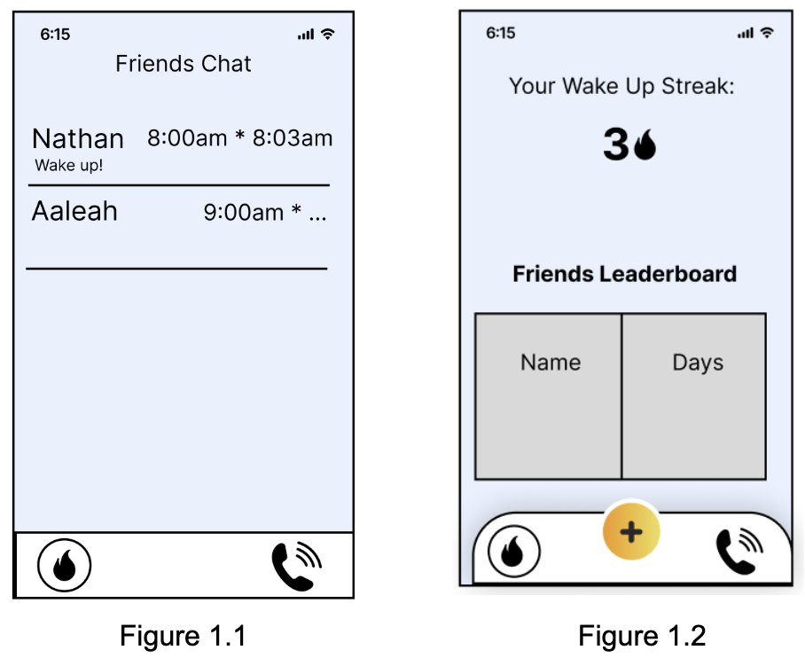
Task 1: Friends waking user up through social accountability
In this feature, friends play a pivotal role in waking the user up through social accountability. Friends are encouraged to send wake-up prompts to the user, creating a supportive and engaging network to ensure a timely start to the day. Upon receiving a wake-up prompt, the user is notified with a message from their friend such as that of Figure 1.1. This feature leverages the motivational power of social connections, fostering a sense of responsibility and encouragement among peers. Users can customize their preferences, choosing friends they trust for wake-up calls and setting the frequency of such prompts. Additionally, leaderboards among friends can entice friendly competition that can motivate users to consistently wake up on time such as that of Figure 1.2. This competitive element introduces a gamified aspect, where friends earn points or badges based on their prompt reliability or the number of successful wake-ups they contribute to. The leaderboards not only add a playful dimension to the wake-up process but also create a positive peer pressure that encourages a consistent wake-up routine.
Task 2: Setting alarm
Setting the alarm should be as similar as possible to the default iOS way of setting alarms so the user won’t need to learn any extra functionality. We aim to have certain restrictions on top of the usual iOS alarm, such as limiting how close two alarms can be set by one hour to prevent overlap with the snoozing features. As in the iOS clock app, users can add as many alarms as they like (within the stated constraints) and have them toggle between active and inactive, as well as what specific days they are set for. Our preliminary design for the UI is shown below.

Task 3: Answering a question to keep streak
A way for users to wake up is by implementing a gyroscope so the user has to sit up before answering the question of the day. We aim for these types of questions to make the user rack their brain, meaning they have to be fully awake by the time they finish their answer; thus, efficiently waking them up (see figures 2.1 and 2.2). Another incentive to answer questions is a streak. For every consecutive day the user wakes up and answers the wake-up question, the streak will increase by 1 day (see figure 2.3). Users can view their friends’ streaks on a leaderboard, to keep each other accountable on waking up. On the circumstance that the user misses their alarm, a nudge notification appears to warn the user that their streak will end which gives the user urgency to wake up (see figure 2.4).

C: Wizard of Oz Testing
Our goals were to see how usable our idea was and if the idea itself makes sense. We mainly learned that we should further disincentivize pressing the snooze button by making it harder to press and make the stop button much more prominent. From our feedback, we learned that this would prevent some accidental snoozes. We got good feedback on our wakeup ideas, especially the “brainteaser” game. We should also focus on changing our icons to more effectively represent what clicking the buttons or tabs actually do, like a messaging icon or profile icon instead of what we have now. Our prototype overall was seen as easy to navigate and understand.
We learned that the wizard of oz session ensures that the flow of each screen is understandable. We also learned that there are some changes to implement in our prototype after the wizard of oz session. One change is to replace the “call” logo on the bottom of the screen with a “chat” logo because the tester was confused if the app is a chatroom or a call room. Another confusing aspect was the big plus button on the middle because the tester didn’t realize the button is for adding alarms. The tester liked the trivia question because it made them wake up.
Our findings were quite encouraging. The user who tried out our product found it remarkably easy to use, almost intuitive in its operation. They especially appreciated the social accountability aspect, where their friend could simply click a button to set off an alarm. This feature resonated with them, adding a sense of immediacy and communal involvement to the experience. Their feedback emphasizes the user-friendly design and the meaningful way our product encourages connections and shared responsibilities among its users.
One element we will keep in our next iteration is the streak system to encourage the user to wake up on time. The second element we will keep is our trivia question in order to wake up the user. Additionally, we will include the chat box to text your friends to wake up.
We need to revise our icons and button placement. We were brought to the attent ion of our tab buttons which didn’t have very intuitive icons for what they did, so we will need to change those. Additionally, our snooze button was too big, especially for an app that is supposed to disincentivize snoozing. We learned that if the button is easier to press, some students could press it out of convenience instead of stopping the alarm and waking up.