Low Fidelity Prototype
Description of your low-fidelity prototype
Our low-fidelity prototype is composed of two parts. For the first part we use a Wizard of Oz approach by dividing up our users into two groups and promoting a discussion between them. During this part we encourage the users to try to debate utilizing facts and provide them with a google document to manage their sources. Then moving forward we provide users with our website. Through the figma the users then go about exploring the website and completing different tasks.
A part of the prototype that is wizardry for now is the google document, which allows users to modify a joint bibliography and will be implemented as part of the eventual website. Additionally, the figma prototype only allows users to search for one thing right now, but that will eventually be implemented to allow users to search different debate bibliographies on the website from past debates people have had.
Screenshots and photos of the prototype:
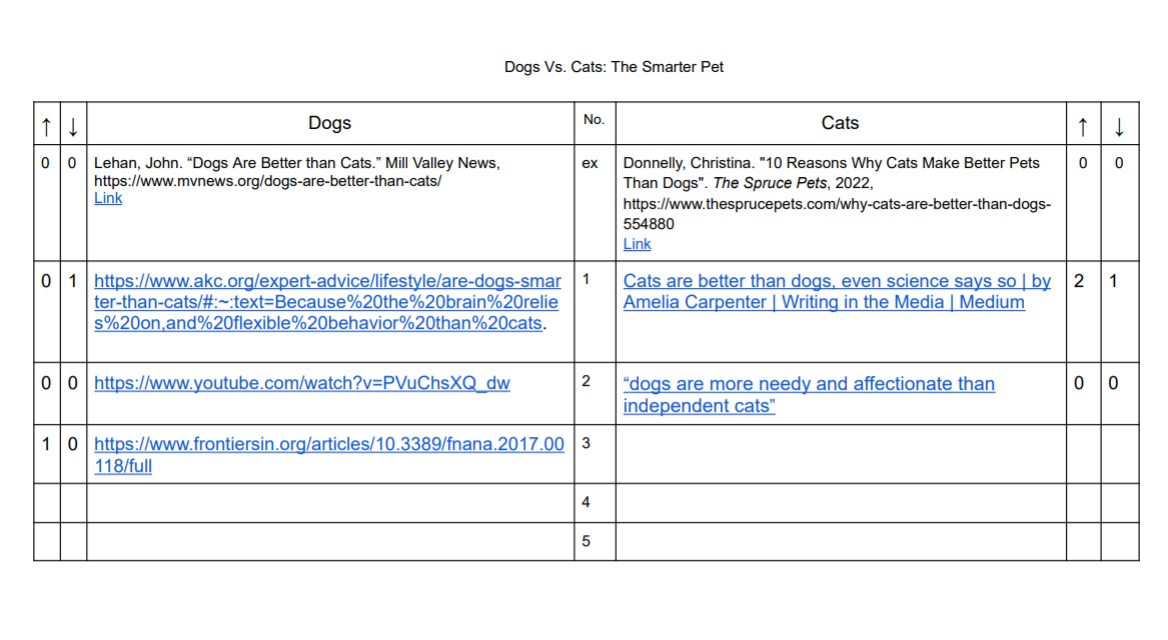
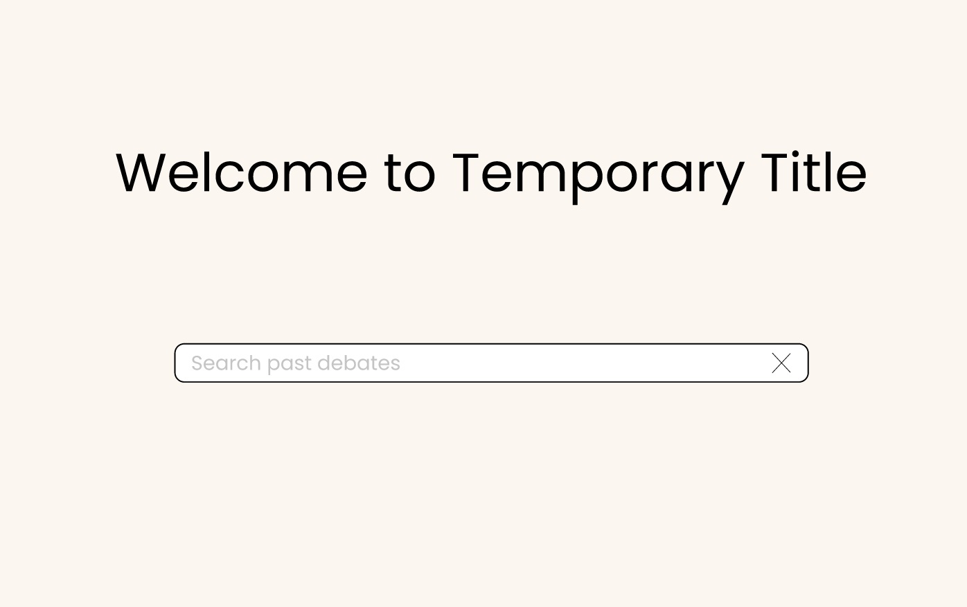
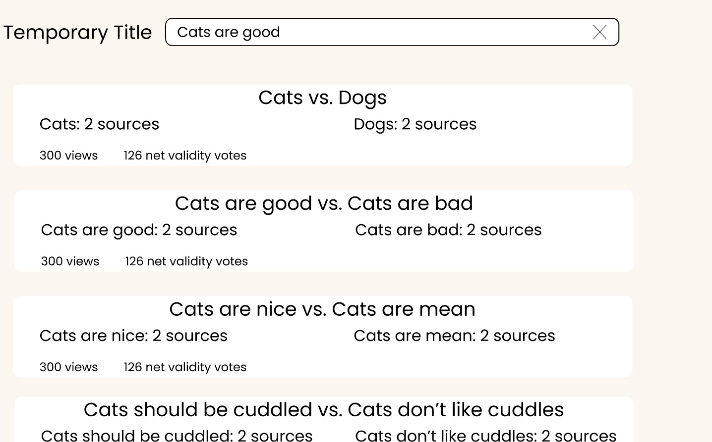
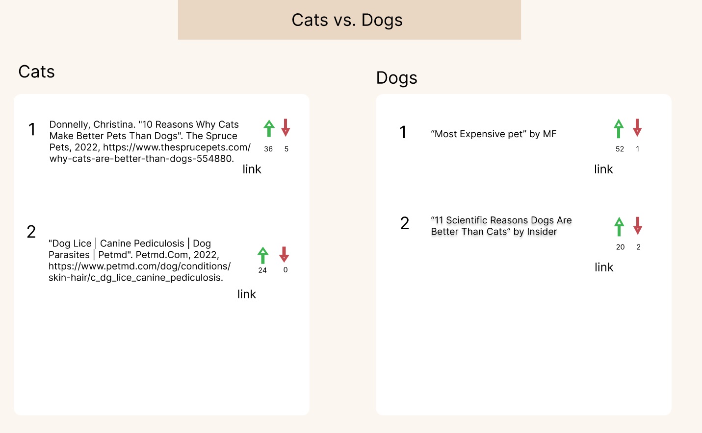
Findings from the wizard of oz testing
Our primary goal was to see how our project would be used in a non-scripted discussion. We wanted to see which features were particularly helpful and how naturally the features fit into the discussion. We also wanted to gauge interest in using the project and how it would be used.
From the session, we learned that users immediately look for information individually on Google when they are thrown into a discussion with the topic. The users commented how having the product to check each other’s claims from their sources is very helpful, especially when the other party’s arguments are getting more “outlandish” and uncommon. The users also mentioned that the voting system and public environment of the joint bibliography made them think twice before saying/citing an article. They have a feeling that they should read and confirm it before including it in the discussions. The users also pointed out a few things that the product lacked, such as maybe having an overwhelming amount of citations in a big discussion, and that it would be difficult to go through every single source that is cited.
Main Takeaways
Our findings demonstrated that our project has a place in online discussions. Even in a casual discussion, the users began demanding sources to back claims. Some claims were a bit outlandish and users found it helpful to have the links all in one place. The upvoting made users think twice before quoting a source.
The search feature, a voting system, website format of both sides on the same page (our definition of a “joint-bibliography”). These elements we found were intuitive to our users where there was not much question to their existence. We found that these elements helped the users have a streamlined experience and some even helped them generate ideas for their debate.
Future Implementation
We heard some great suggestions from our users. One was to be wary of how voting on sources could lead to a majority opinion seeming more valid because of how people vote based on their opinion and not the merit of sources. Users need to know that they are voting on the validity of the source, not on if the source takes their side.
We believe voting has a place in the project. We have a flow in the Figma prototype that shows a pop-up when users try to vote on a bibliography, targeted to deter mindless voting. Unfortunately due to time limitations we were unable to test this feature, but we plan to discuss further on how to manage voting. Discussions have led to a possibility of a scale-graded voting system (similar to Instagram slider emoji).
We were also made aware that it can be daunting for users to be confronted with a lot of sources at once. If there are so many sources, users won’t be able or willing to read them all. We need to find a way to distinguish the most relevant sources so users can have a limited list of sources to begin with. This issue may be solved by adding a column to specify or pinpoint which parts of the articles are important to the discussion.
Finally, we want to find a cleaner way to lead users to clicking links to sources. We witnessed a user attempt to click the link in the actual bibliography entry instead of the “Link” button next to it. There should be no ambiguity in how to look at a source.