Low Fidelity Prototype
A – Description of the low-fidelity prototype
We created two mockups (sketch and Figma) demonstrating the following components
- A transparent overlay displaying the status of other people in your ‘room’
- A summary menu presented when hovering over a specific person
- (Sketch only) An insights page visualizing aggregated data
The wizardry that will need to be implemented includes:
- Rooms functionality – How do you group people in the same room?
- Data collection – How should we collect and measure raw data, like typing activity?
- Insight generation – How should raw data be converted/displayed as insights?
B – The Prototype
The prototype can be playtested via presentation mode on Figma. Below are some alternate idea sketches:
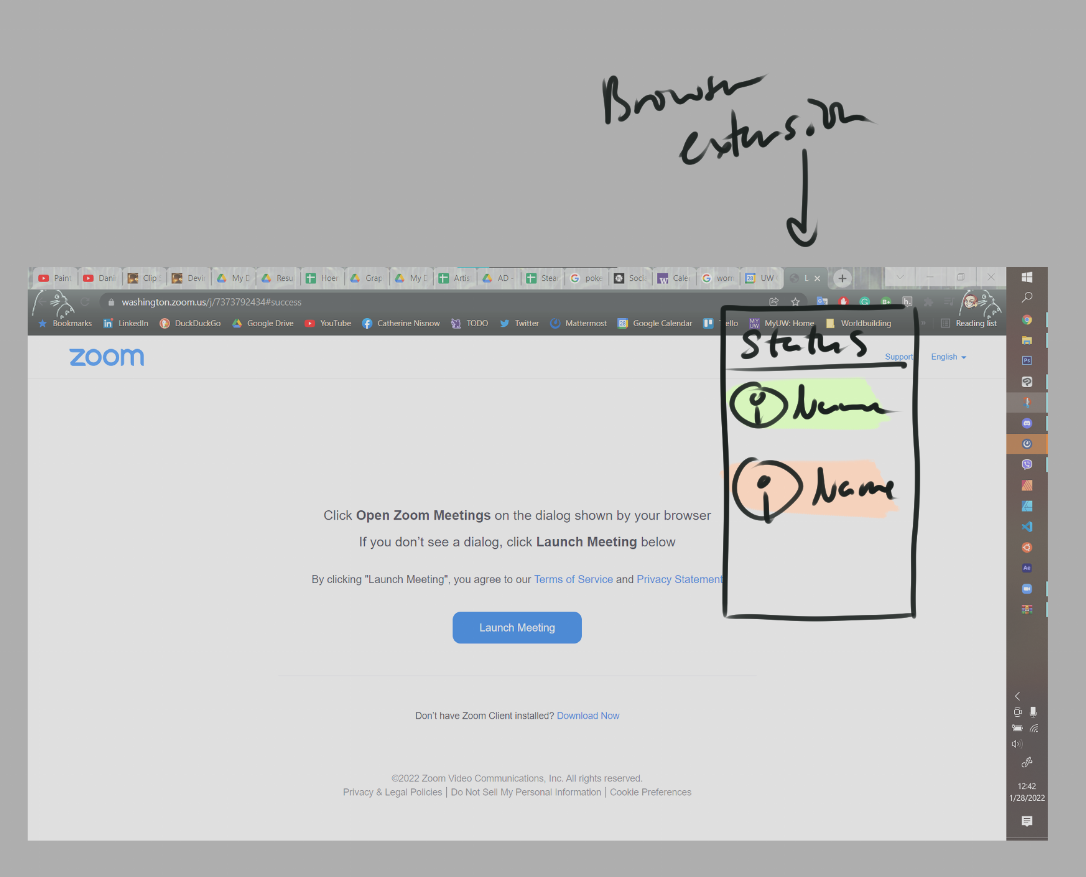
Sketches for the browser extension “dropdown”
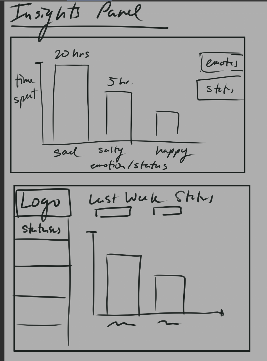
Potential panels for ‘insights’
C – Findings
When engaging with participants, we wanted to understand the following key items:
- Motivation – Why would participants use our extension? Were there more specific reasons beyond ‘wanting to feel connected’? (e.g. monitoring productivity)
- Interaction – Where were friction points when interacting with software? Was there data that users were interested in seeing that we weren’t showing (and vice versa)?
- Obtrusiveness – Is the extension disruptive? Our project is minimalistic and should be a seamless add-on to help users feel connected through low-touch interactions.
- Privacy – How do users feel about data such as browser tab information being used and displayed? Are users concerned about this data being stored?
During our session, we learned:
- Motivation – One user of the other team expressed that ‘being nosy’ was a more specific way to feel connected with other people; i.e. having access to somewhat private but still acceptable shared information helps create a sense of closeness.
- Interaction – Users felt that needing to hover over people in their ‘room’ in order to see data was an “extra step”; we will pursue more efficient visualizations. Also, test statistics provided (wpm / tabs) were not of interest to our users; other information, like the app last used, was thought to be more interesting. Users were especially interested in ‘quirky’ insights rather than solely productivity-related metrics (e.g. real-time animations indicating that a user is typing, specific videos/music being played).
- Obtrusiveness – Users agreed that the general idea of an overlay was not obtrusive, but the positioning and design could be improved (e.g. only show the overlay when clicking on the browser extension, choosing a different color / indication design). Overall, though, they agree with our aim to minimize obtrusiveness. Users seemed to prefer the “always-on” overlay over a traditional browser extension whose icon in the top right of the browser needs to be clicked to allow further interaction.
- Privacy – Users seem to feel comfortable with the current use of their data – they are not concerned as long as data is only being shared with the other people in the “room.”
This user study leads us to believe that this project is feasible, albeit with a focus on minimalism and concerted experimentation of ‘quirky’ insights which help users feel connected. In particular, we want to test the following next steps for our idea:
- Overlay layout – How can info be displayed in minimalist, low-interaction ways?
- Content and metrics – What info do users really want to see?
- Varied motivation – While some people expressed wanting to be ‘nosy,’ this is not the only form of closeness; there could also be competitiveness (“Are they being more productive than me?”), mutual support (“Would they like some help pair programming?”), or another unexplored attitude.